I would like to learn using as many colors as you do, do you have any tips for that? Or is it all intuition?
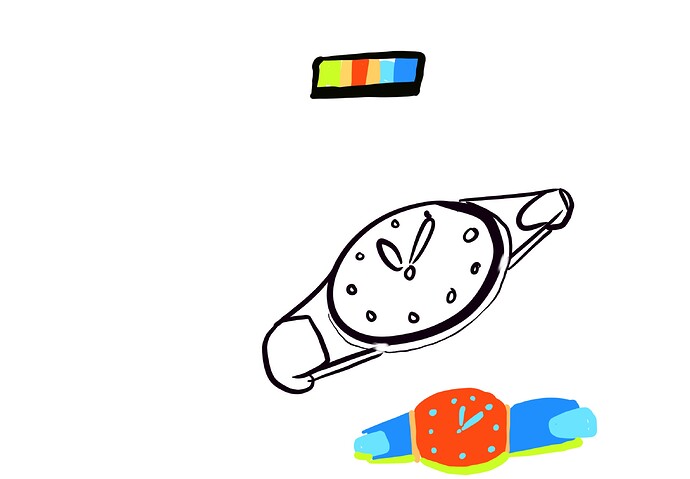
It’s better to have less colours my colour choice in digital art is chaotic. But if you want to really pop out and shine colours , create first colour palette ![]() with colours you want to use like for example 12 colours and then colour your object , but first colour 12 little squares little and see how they go along , when you have full palette created then colour the object. I think it’s good strategy
with colours you want to use like for example 12 colours and then colour your object , but first colour 12 little squares little and see how they go along , when you have full palette created then colour the object. I think it’s good strategy ![]()
Cool, I will try doing that!
In your watch I would make floor wooden littlebit lighter to have more contrast between floor and watch . Or it’s table. And values is more important in art then colour .
The coloured watch red isn’t good but I just made it fast. It would be better darker I think
Is that a Rolex!!!
It can be whatever you want it to be. ![]() I modeled the case after some random watch I found on google, the rest is just something I made up.
I modeled the case after some random watch I found on google, the rest is just something I made up.
It’s nice man !!! I want to work on something now😁
Thanks! Glad I could inspire ![]()
This topic was automatically closed 95 days after the last reply. New replies are no longer allowed.
